THE Word... Not Microsoft Word
by Denn Guptill
One of the unexpected benefits that we have discovered with using PowerPoint as a part of our worship celebration is the added visibility of the Word of God.
There are several fairly obvious places in your service for scripture as well some instances where you can sneak it in. I love taking the opportunity to expose my people to God's Word whenever I can.
Scripture Reading
At Cornerstone we have the Scripture that I will be preaching from read early in the service and we project the scripture as it is being read aloud. I understand the argument that by projecting your Scripture you will encourage your people to not bring their Bibles to church. Here's the news folks: some of your people will bring their Bibles to church and some won't.
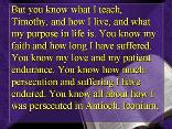
We had projected our Scripture readings the first two years we were using PowerPoint, but after reading a fairly persuasive argument against the practice we stopped. For several months we used a transition slide that said “The Word of God” along with the reference but didn’t project the full text. What changed my mind was being in another service where the Scriptures weren't displayed. The speaker was reading from the fifteenth chapter of John's Gospel and in verse 5 where it says “I am the vine; you are the branches.” the speaker inadvertently included an extra word. What he read was “I am not the vine; you are the branches.” I was following along in my Bible so I realized that he had goofed. However, looking around at the rest of the crowd most of them weren’t following along. Some didn’t have a Bible with them and many of those who were carrying Bibles didn’t have them open. And so, at some level, maybe only subconsciously, some people heard that Jesus was not the vine. The next Sunday we started projecting our Scriptures again.
When you project your Scriptures, set them apart from the rest of the presentation. We have chosen a specific font that we use whenever there are Scripture verses on the screen. We picked Georgia for no other reason than I like it. It is an attractive font that is not distracting. We also use a specific background and people know that at this point something different is happening... we are going to read the Word of God.
In order to encourage your people to bring their Bibles with them don’t rely entirely on the image. Instead of simply stating, “You will see the Scripture on the screen,” Say something to the effect of, “Open your Bibles to John 3:16. If you don’t have your Bible with you today, the Scripture will be on the screen.” And allow people the time to turn to the appropriate reference. The temptation is to immediately begin reading and if you do that it won’t matter if you are projecting the verses or not. People aren’t going to follow along in their Bibles if they have to frantically flip pages trying to find the reference. By giving your people a little bit of time while leaving the title screen up the have the time to find the reference as well as a reminder of what it is.
The Message
The second obvious place for the use of Scriptures is within your message. Personally, I tend to speak fast. I’m actually writing this very slowly because I know that not everyone is a fast reader. I also tend to use a lot of Scriptures in my messages. And because of that combination it’s very difficult for people to flip in their Bibles and follow the message at the same time. Most people don’t bother, and even though they are hearing the word they aren’t actually seeing it. By displaying at least the key Scriptures you are using in your message, the visual impact reinforces the context of the message.
Because we primarily use one translation of the Bible and it is identified in the copyright slide that we display during the announcements the only time we identify the translation we are using is if it is different from our primary translation. When we do need to identify a translation we simply note after the Scripture verse with the appropriate abbreviation. [i.e. John 3:16 (KJV)] For God so loved the world, that he gave his only begotten son that whosoever believeth in him should not perish, but have everlasting life.
We use the Georgia font, because it is our Scripture font. If you see text displayed in Georgia at BCC you know that it’s from the Bible. There are several different ways of displaying the Word during your message, the main thing is to keep it legible and don’t cram too much onto one slide. Remember, slides are free.
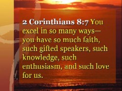
Maintain the continuity of your message by continuing to use the same background for your scripture slides but use a distinct style that says, “Hey everyone, this is the Bible!” Most recently, I’ve started to use a semitransparent box with my scripture set into it. I use yellow for the text and a bold white for the reference.
|
Hint: On a blank slide draw a rectangle by clicking on the rectangle icon (A.) and then dragging your shape to the appropriate size. Double click on the shape you’ve created. Under the color tab, click the arrow next to the color selection and select a color close to your background. If you can’t find at color close enough, click on more colors. Set the transparency level at 70%. Now click the line color and select no line. Close your dialogue box. Draw a text box over your new shape and paste in your scripture text. Select your font style and set the size to at least 36. Now select your rectangle and text box, right click, select grouping and group. You now have one object to move, resize, etc. Copyright Denn Guptill / PowerPoint4Preaching.com
|